1. Data Visualization Kya Hai?
Data Visualization ka matlab hai
Raw data ko graphical form me dikhana taaki insan use easily samajh sake.
Simple words me
Data → Graph → Information → Decision
Example
Suppose company ke paas ye sales data hai
Month | Sales |
|---|---|
Jan | 12 Lakh |
Feb | 15 Lakh |
Mar | 18 Lakh |
Apr | 13 Lakh |
Table dekhne se itna quickly samajh nahi aata.
Agar isi ko line chart bana do
Sales

18|
17|
16|
15|        *
14|
13|             *
12|  *
11|
    Jan Feb Mar Apr
Ab ek second me samajh aa gaya
Sales increase hui
Fir April me decrease hui
Isi ko visualization bolte hain.
2. Visualization ki Need Kyu Hai?
Real world me companies ke paas
Lakhs rows
Crores rows
Hundreds columns
hoti hain.
Example
Amazon
10 crore orders
Agar manager table dekhega to kuch samajh nahi aayega.
Visualization banaoge to turant dikhega
Best selling product
Worst month
Highest revenue
Customer age group
Profit trend
Isliye visualization decision making ka part hai.
3. Visualization Ka Goal
Visualization ka purpose sirf graph banana nahi hota.
Uska purpose hota hai
Story batana.
Example
Galat Question
Sales kitni thi?
Achha Question
Sales kab badhi?
Kab ghati?
Kis product ki wajah se badhi?
Visualization questions ka answer deta hai.
4. Data Visualization Process
Raw Data

↓

Cleaning

↓

Analysis

↓

Visualization

↓

Insights

↓

Decision
Ye pura pipeline har company use karti hai.
5. Matplotlib Kya Hai?
Matplotlib Python ki sabse purani aur sabse popular plotting library hai.
Ye almost har type ka graph bana sakti hai.
Example
Line Chart
Bar Chart
Scatter Plot
Histogram
Pie Chart
Box Plot
Ye low level library hai.
Matlab
Tum har cheez customize kar sakte ho.
Example
Color
Font
Axis
Marker
Grid
Legend
Sab kuch.
Advantages
✔ Flexible
✔ Powerful
✔ Industry Standard
✔ Complete Control
Disadvantages
Thoda verbose hai.
Ek simple graph ke liye bhi kaafi code likhna padta hai.
6. Seaborn Kya Hai?
Seaborn bhi visualization library hai.
Lekin
Ye Matplotlib ke upar bani hui hai.
Matlab
Seaborn
     ↓
Matplotlib
Internally Seaborn bhi Matplotlib hi use karta hai.
Seaborn ka Goal
Beautiful graphs
Kam code
Better defaults
Example
Matplotlib
20 lines
Seaborn
5 lines
Same graph.
Matplotlib vs Seaborn
Matplotlib | Seaborn |
|---|---|
Low Level | High Level |
More Control | Easy to Use |
More Code | Less Code |
Basic Styling | Beautiful Styling |
Complex Customization | Statistical Visualization |
Base Library | Built on Matplotlib |
7. Visualization Banane Se Pehle Kya Sochna Chahiye?
Sabse important question
Mera data kis type ka hai?
Visualization hamesha data type ke according select hoti hai.
Data generally 2 type ka hota hai.
Numerical Data
Example
Salary
Height
Weight
Age
Categorical Data
Example
City
Gender
Department
Product
Visualization bhi isi basis par choose hoti hai.
Most Important Charts
Ab sabse important part.
Ye charts almost har interview aur project me use hote hain.
1. Line Chart
Purpose
Trend dekhna.
Time ke saath change.
Example
Stock Price
Temperature
Revenue
Sales
Website Traffic
Best For
Time Series Data
Question Answer karta hai
Increase ho raha hai ya decrease?
2. Bar Chart
Purpose
Categories compare karna.
Example
Sales by
Delhi
Jaipur
Mumbai
Pune
Question
Sabse jyada kis city me sale hui?
Best For
Categorical Comparison
3. Horizontal Bar Chart
Jab category names bade ho.
Example
Machine Learning

Data Engineering

Artificial Intelligence
Vertical bar me names overlap ho jayenge.
Horizontal better hota hai.
4. Histogram
Purpose
Distribution dekhna.
Example
1000 students ke marks
Question
Most students kis range me hain?
0-10

10-20

20-30

30-40
Histogram data ko bins me divide karta hai.
Best For
Distribution
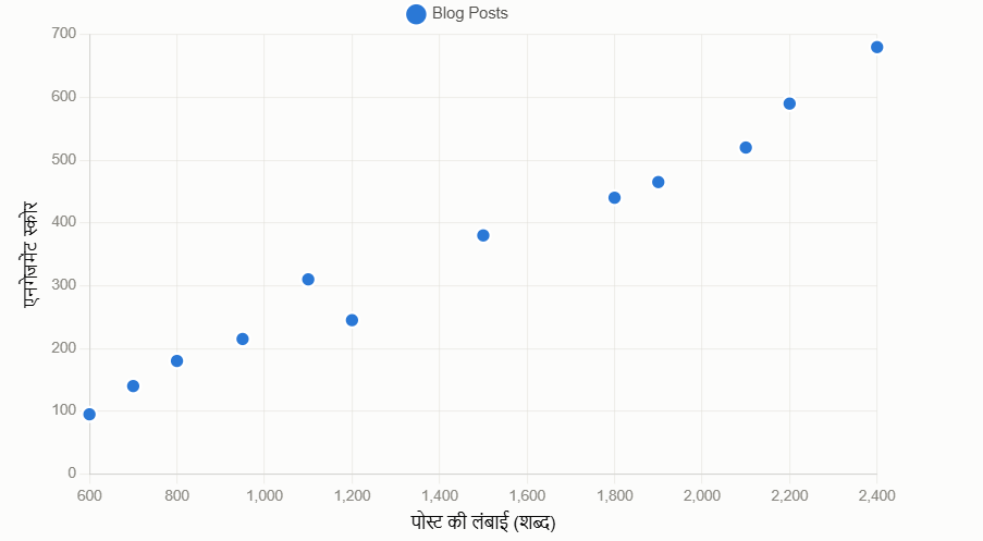
5. Scatter Plot
Purpose
Do numerical variables ka relationship.
Example
Experience vs Salary
Question
Experience badhne par salary badh rahi hai?
Agar points line jaisa pattern banaye?
Positive Relationship?
Random?
No Relationship?
6. Pie Chart
Purpose
Percentage dikhana.
Example
Market Share
Apple
Samsung
Vivo
Oppo
Question
Kis company ka kitna share hai?
Note:
Pie chart tabhi use karo jab categories kam (3–6) ho aur total ka percentage dikhana ho. Bahut saari categories ya exact comparison ke liye bar chart zyada effective hota hai.
7. Box Plot
Box Plot एक statistical graph है जो किसी data के distribution (फैलाव) को 5 मुख्य values के ज़रिए दिखाता है।
5 मुख्य parts होते हैं:
Minimum — सबसे छोटी value (outliers छोड़कर)
Q1 (25th percentile) — नीचे के 25% data की upper limit
Median (Q2) — बिल्कुल बीच की value
Q3 (75th percentile) — नीचे के 75% data की upper limit
Maximum — सबसे बड़ी value (outliers छोड़कर)
IQR (Interquartile Range) = Q3 − Q1 → यही box की चौड़ाई होती है।
Real Example: मान लो एक class के 10 students के marks हैं: 12, 45, 50, 55, 60, 65, 70, 75, 80, 95
तो: Min=45, Q1=52, Median=62, Q3=73, Max=80 — और 12 व 95 outliers हैं।
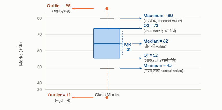
Box Plot एक "5-number summary" को visually दिखाता है। उदाहरण के साथ देखो — ऊपर diagram में student marks का data है।
Whiskers क्यों होते हैं? Whiskers वो range दिखाते हैं जो normal मानी जाती है। इससे बाहर जो values हों वो outliers (orange dots) होती हैं — जैसे कोई student बहुत ज़्यादा (95) या बहुत कम (12) marks लाए।
Box Plot कब use करते हैं? जब compare करना हो — जैसे boys vs girls के marks, या अलग-अलग subjects की performance — तब एक साथ कई box plots side-by-side रखते हैं।
8. Heatmap
Heatmap एक 2D grid होता है जहाँ हर cell की color उसकी value बताती है — जितनी गहरी color, उतनी बड़ी value।
Simple Example: एक class के students के अलग-अलग subjects में weekly performance — कौन से दिन कौन सा subject अच्छा या बुरा रहा, यह heatmap से एक नज़र में दिखता है।
Count Plot vs Heatmap:
Count Plot → एक variable की frequency
Heatmap → दो variables के बीच का relationship, color से दिखाया
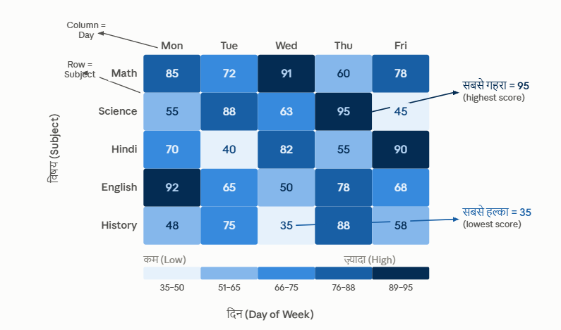
ऊपर diagram में हर cell एक subject + day का combination है, और उसकी color उस दिन के score को दिखाती है।
Color का मतलब: गहरी नीली color → ज़्यादा score, हल्की color → कम score। नीचे का color scale (legend) देखकर कोई भी value समझ सकते हो।
Key Points:
Rows → एक variable (यहाँ Subject)
Columns → दूसरा variable (यहाँ Day)
Cell की color → उन दोनों का intersection value
Pattern पकड़ना आसान — जैसे ऊपर देखो, Science का Thursday और English का Monday बहुत dark है यानी उन दिनों performance बहुत अच्छी थी।
Heatmap कब use करें? जब दो categorical variables के बीच का pattern या correlation एक साथ देखना हो — जैसे website traffic (hour × day), exam scores (student × subject), या temperature (month × city).